Finding and understanding your website data just got simpler, thanks to plot rows in Google Analytics 4. This new feature brings back a much-loved capability from Universal Analytics that many users have been missing.
In this guide, I’ll show you exactly how this powerful visualization tool works and how it can help you make smarter, data-driven decisions without creating complex custom reports.
Table of Contents:
- What is the Plot Rows Feature?
- Why Plot Rows is a Game-Changer for Your Analytics
- Essential Tips Before You Start Plotting Rows
- How to Use Plot Rows in Google Analytics 4
- Make Analytics Even Easier with ExactMetrics
- FAQs: Using Plot Rows in Google Analytics 4
What is the Plot Rows Feature?
The Plot Rows feature is Google Analytics 4’s answer to something that was previously automatic in Universal Analytics.
It lets you select specific rows of data to visualize on your graph, making it easier to spot trends and compare metrics across different pages, campaigns, traffic sources, or any other dimension in your GA4 reports.
Why Plot Rows is a Game-Changer for Your Analytics
This simple button significantly improves how you analyze your GA4 data by helping you:
- Compare traffic trends across individual pages to identify winners and losers
- Spot upward or downward patterns in key metrics that need your attention
- Visually analyze how different campaigns perform against each other
- Track how audience segments engage with your site over time
- Monitor conversion events like sign-ups, downloads, or purchases
- Identify product performance trends at a glance
For many GA4 users, this feature brings back the intuitive visualization that made Universal Analytics so user-friendly. I, for one, am super excited to have this powerful feature back!
Essential Tips Before You Start Plotting Rows
Before diving into the step-by-step tutorial, I want to share some helpful tips and tricks for using plot rows in Google Analytics 4:
1. Managing the Total Line
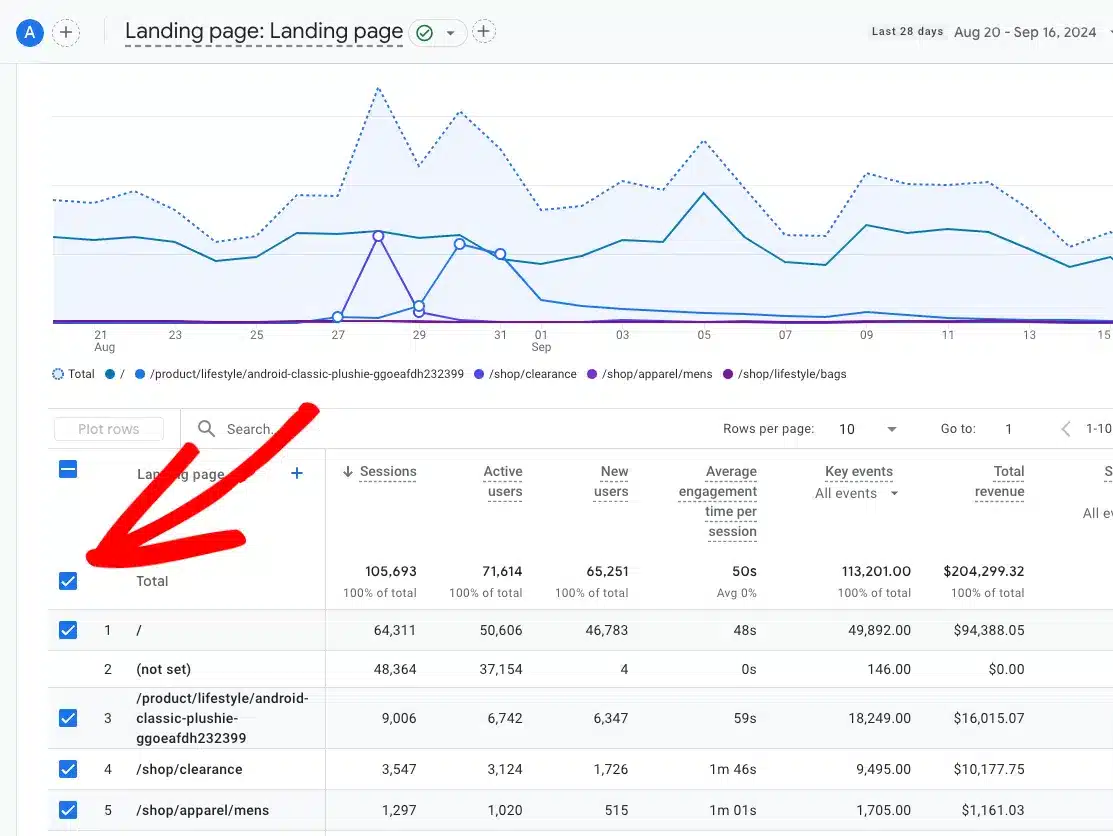
When you first open a report, you’ll notice a dotted line for the total on your graph. This can sometimes make it difficult to see the trends in your other selected lines.
To remove it, simply uncheck the box next to Total:
2. Starting With a Clean Graph
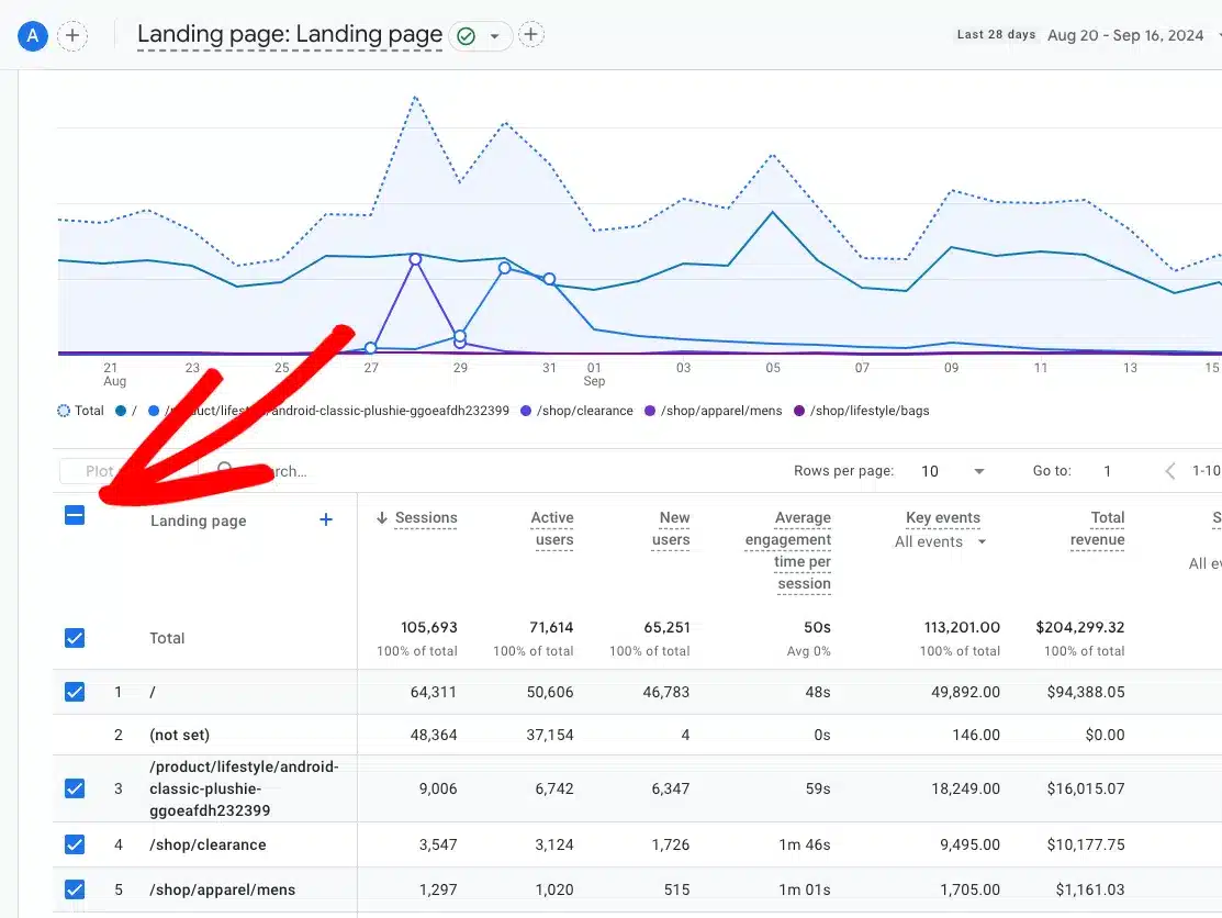
Want to start fresh? Rather than unchecking rows individually, click the line symbol at the top of the column to uncheck all rows at once:
3. Understanding the 5-Row Limit
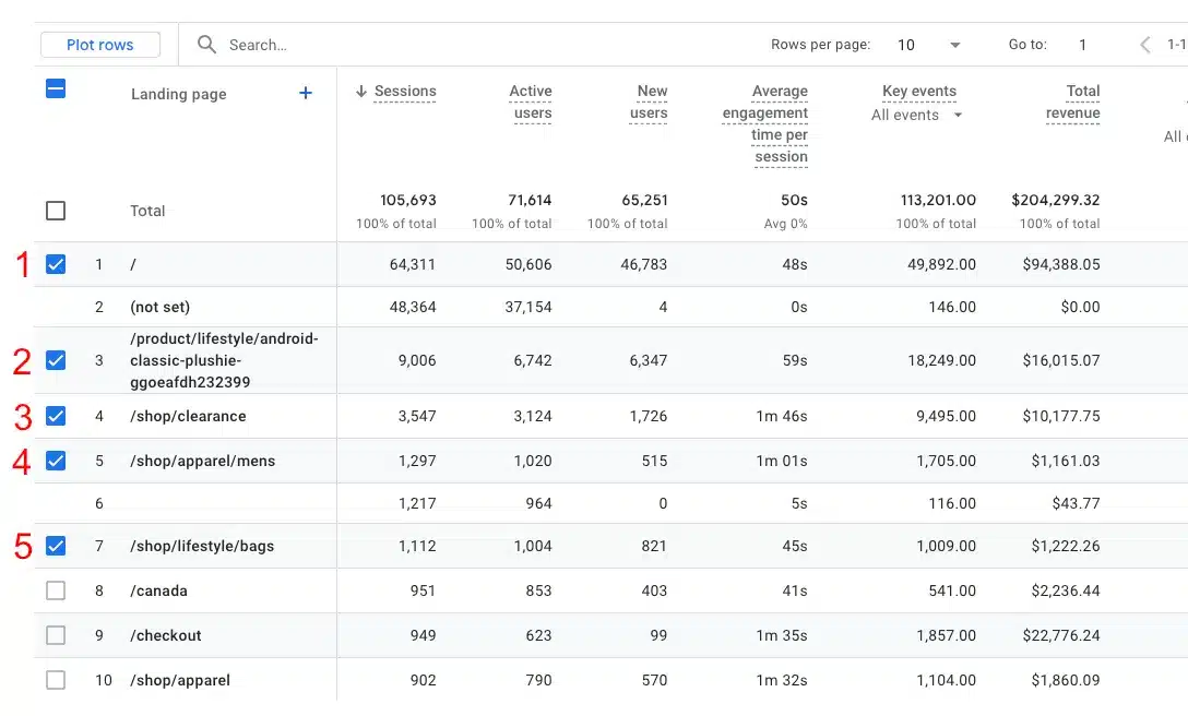
GA4 limits you to plotting a maximum of 5 rows on your graph at once. Once you’ve reached this limit, the remaining checkboxes will be grayed out:
4. Ensuring Your Rows Are Visible
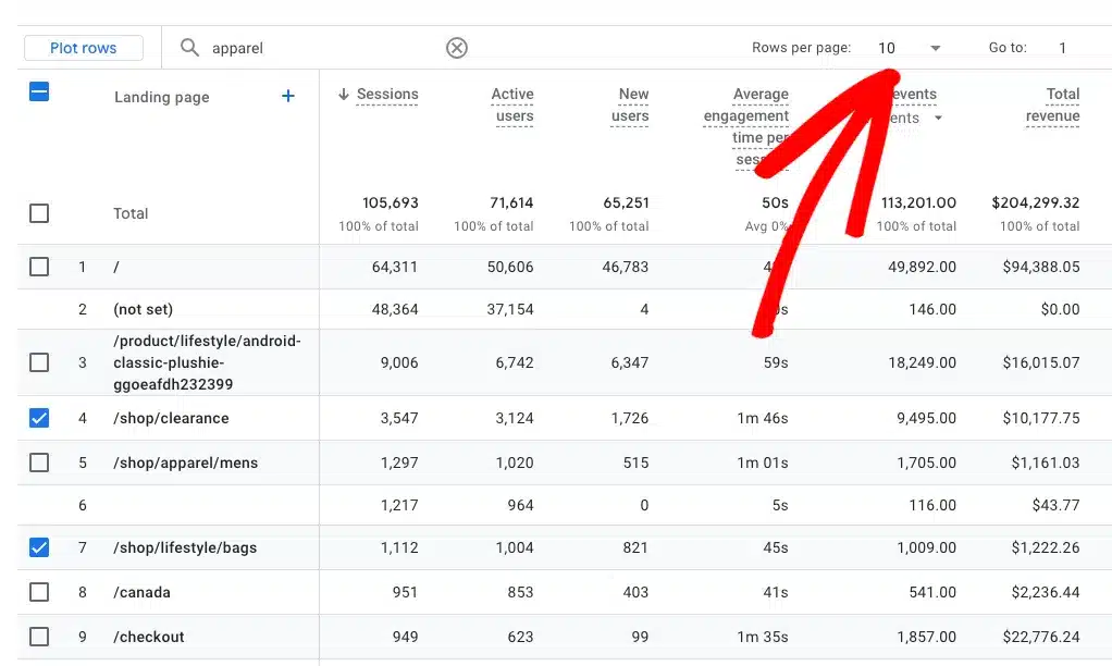
You can only plot rows that are currently visible in your view. If you search or navigate to another page, your row selections will reset.
To ensure all your desired rows are visible, increase the Rows per page setting:
How to Use Plot Rows in Google Analytics 4
Now that you know bthe est little tricks, let’s walk through exactly how to use this feature with a practical example.
Step 1: Set Up Your Report
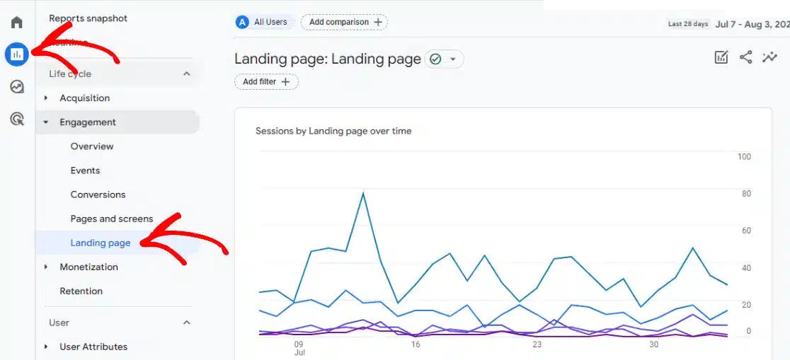
First, navigate to the report where you want to plot specific rows.
For this tutorial, I’ll focus on tracking visits to specific pages – one of the most missed features from Universal Analytics.
First, go to Engagement » Landing page:
Select your desired time frame using the date picker:
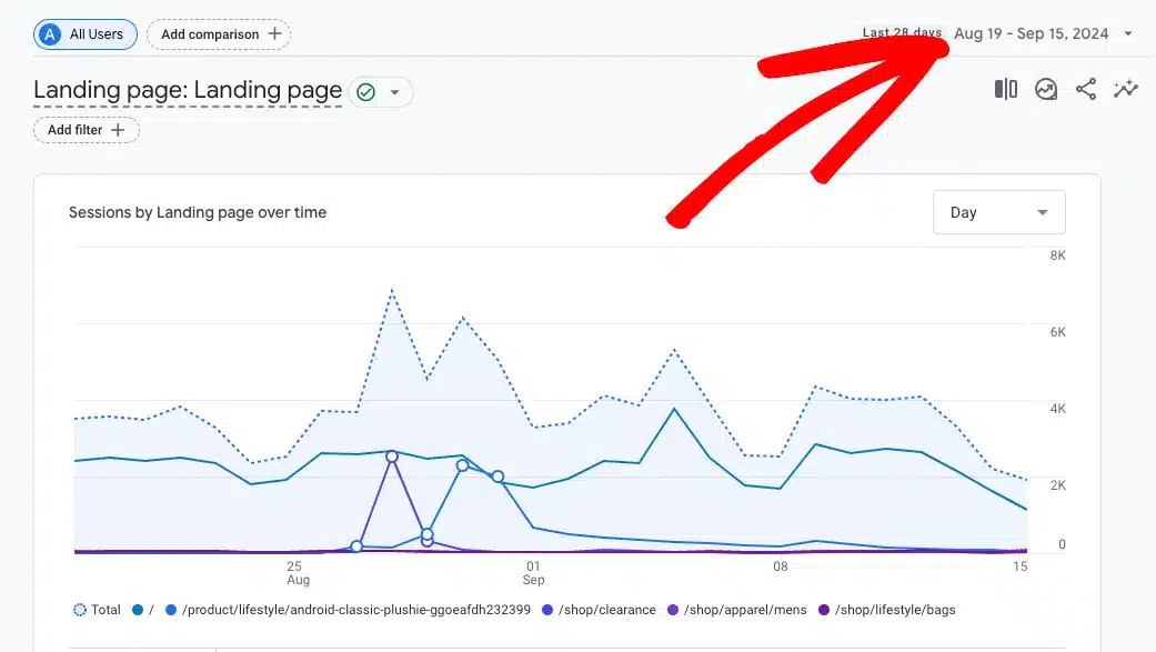
Step 2: Select and Plot Your Rows
Now it’s time to choose which rows you want to visualize on your graph:
- Set Rows per page to a higher number so you can see all the rows you might want to plot
- Click the line icon to uncheck all rows and start with a clean slate
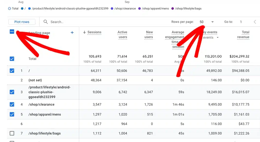
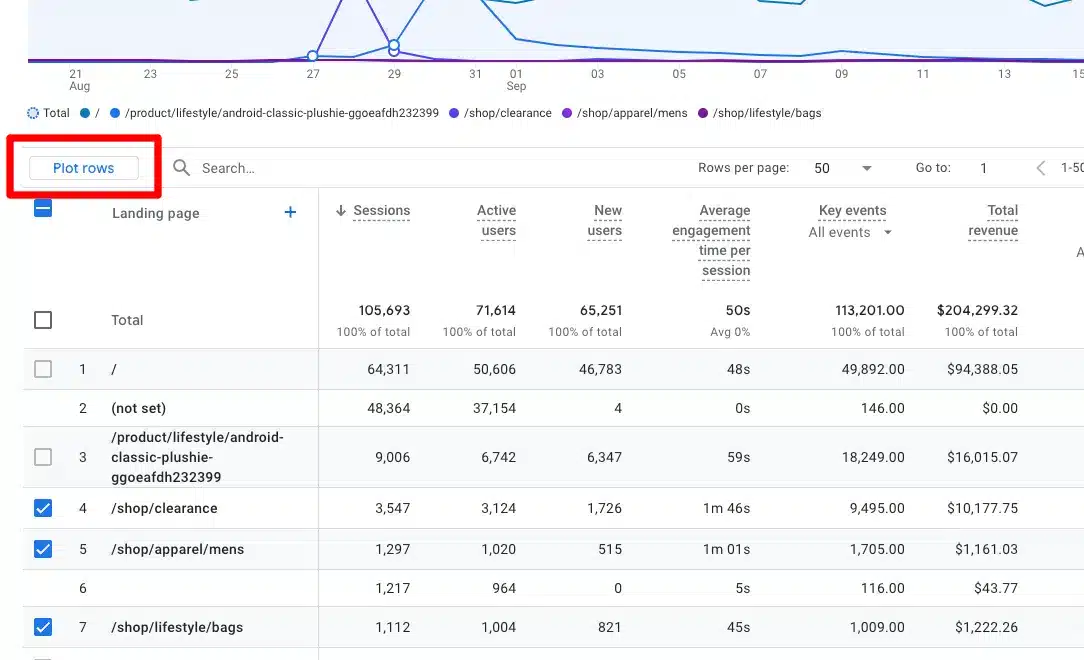
- Select up to 5 rows that you want to compare (in this example, I’ll select my top 5 category shopping pages)
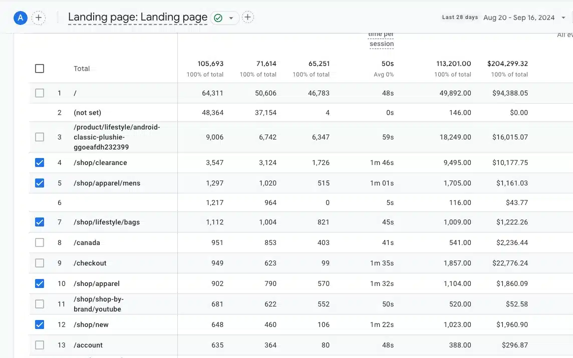
- Scroll up and click the Plot Rows button:
That’s it!
Your selected rows will now appear as colored lines on the graph. Hover over any line to see which page it represents and view the specific numbers for each day:
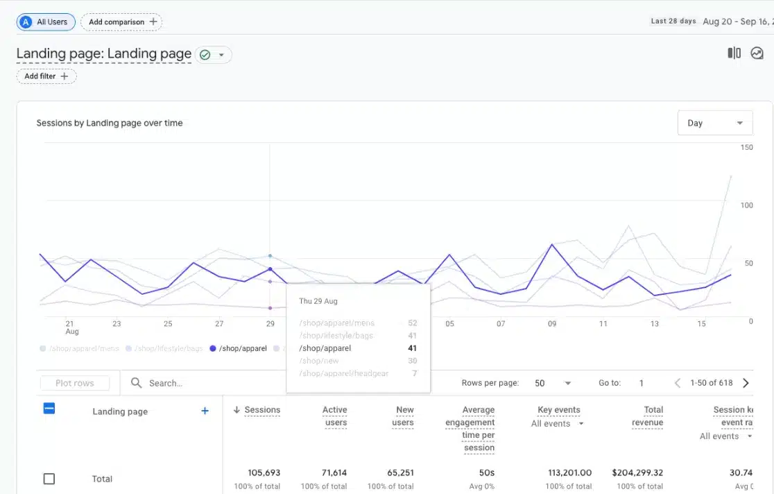
You can use this same method in most standard GA4 reports to visualize campaigns, events, traffic channels, and more.
Make Analytics Even Easier with ExactMetrics
The new plot rows feature in Google Analytics is an amazing addition to the tool. However, I want to quickly introduce you to an even easier and more powerful alternative to Google Analytics.
If you have a WordPress website, you can make tracking your data even simpler with ExactMetrics – the best Google Analytics plugin for WordPress.
ExactMetrics brings your important Google Analytics data directly into your WordPress dashboard in easy-to-understand reports:
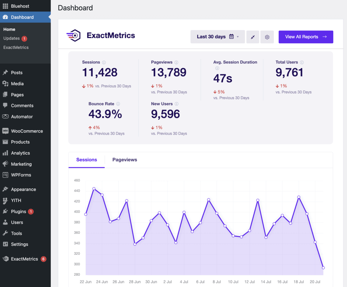
It requires zero coding and can be set up in a few easy clicks and a few minutes. Plus, it automatically sets up advanced tracking features that don’t come standard with Google Analytics, including:
- Button click tracking
- eCommerce performance monitoring
- Form submission tracking
- Video engagement metrics
- And much more
ExactMetrics truly is the best tool for any WordPress website owner looking to grow their business. It combines an easy-to-use interface with powerful features, eliminating the need for custom coding or hiring developers. Whether you’re new to website analytics or an experienced user, ExactMetrics helps you track and grow your online business with ease.
Get started with ExactMetrics today!
FAQs: Using Plot Rows in Google Analytics 4
What is the Plot Rows feature in Google Analytics 4?
The Plot Rows feature allows you to select specific rows of data to visualize on your graph in Google Analytics 4. This helps you quickly compare trends across different metrics without creating custom reports.
How many rows can I plot at once in GA4?
You can plot a maximum of 5 rows at once in Google Analytics 4. Once you’ve selected 5 rows, the remaining checkboxes will be grayed out.
How do I remove the total line from my graph?
To remove the total line, simply uncheck the box next to Total at the top of your rows list.
Will my plotted rows stay selected if I change the date range?
No, changing the date range will reset your plotted rows. You’ll need to reselect the rows you want to plot after changing the dates.
I hope you found this tutorial on using plot rows in Google Analytics 4 helpful! Don’t forget to check out these related articles:
- Google Analytics Reports Explained: A Complete Guide
- A Complete Guide to Google Analytics Tracking ID
- Google Analytics Custom Dimensions: Complete Beginner’s Guide
- How to Track Keywords in Google Analytics (GA4 Tutorial)
And don’t forget to follow us on X and Facebook to stay updated on the latest Google Analytics tips and tools.


